Tips to help your customers find what they need in your store
For some retailers, the idea of customers getting lost in their stores could sound quite appealing. But savvy operators know that letting customers get lost, ultimately means lost revenue opportunities. However, it’s surprisingly easy to do, especially with the complexity of many locations and the fact that smartphone mapping services are still catching up to indoor environments.
That’s why navigational signage is so important.
A. What are the advantages of good navigational signage?
It’s a lot more than just helping customers on their way…
- Enhanced customer experience. Navigational signage enables customers to locate what they’re looking for quickly and efficiently. This reduces stress, enhances wellbeing and makes for happier, more loyal customers. It can also be very useful for individuals with accessibility requirements (see below).
- More efficient service. Effective navigational signage means store staff spend less time giving directions and more time focusing on core tasks and higher value customer service—making your workforce more productive and attentive.
- Increased sales. Navigational signage, in conjunction with promotional signage, can encourage customers to take a desired route (e.g. via promotions) and alerts customers to products that perhaps they haven’t considered or have forgotten, thus boosting sales.
- Reinforced brand identity. Navigational signage, just like other signage, can use fonts, imagery and colour to establish a consistent brand experience throughout the store, orienting customers emotionally as well as physically. When aligned with online activity this helps promote the ‘one brand’ image.
B. What’s the best way to design navigational signage for your store?
Let’s start at the beginning…
1. Decide what to sign
You’ll obviously want to highlight key store sections, but you can also use navigational signage to draw customers to new items, seasonal trends and the highest volume sales in a particular location, for instance.
2. Create a journey
How will customers find what they’re looking for (or what they didn’t know they were looking for) from anywhere in the store? Combine formats to create a journey from further away to closer, beginning with high level graphics and wall signage, up to floor signage and aisle blinkers (e.g. ‘eggs’ or wine regions in supermarket shelves).
Remember: navigational signage must anticipate customer behaviour (90% of customers turn right when entering a store!) and work in conjunction with your store layout i.e. from grid to free-flow. It should also be part of an overall wayfinding strategy.
Principles for effective wayfinding include:
● Create an identity at each location, different from all others
● Use landmarks to provide orientation cues and memorable locations
● Create well-structured paths
● Create regions of differing visual character
● Don\’t give the user too many choices in navigation
● Use survey views (give navigators a vista or map)
● Provide signs at decision points to help wayfinding decisions
● Use sight lines to show what\’s ahead
[Source: http://www.ai.mit.edu/projects/infoarch/publications/mfoltz-thesis/node8.html]
3. Stand out and drive action
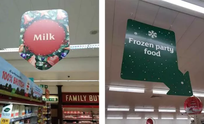
Above all, navigational signage needs to be clear and easy to read. That means:
- Short headlines
- Large, bold fonts
- Engaging visuals
- Unique shapes (e.g. curved edges)
- Highly visible colour schemes (consistent with brand)…
ALL CAPS or lower case? It depends. Block capitals are good for impact but a combination of upper and lower case is more legible at a distance

Image references: POPAI
Colour psychology can have a big impact on the customer experience at a subconscious level. Red is the obvious choice to increase sales but there are lots of subtle associations that retailers can play with to nudge customers one way or the other.
Also, consumer shopping tests have demonstrated that customers may subconsciously look for a brand, rather than product category. Shoppers looking for chocolate, for example, have been proven to search out the colour purple, rather than a sign saying ‘Confectionery’. This is especially true in packaging, but can also apply to signage.
4. What happens when you change your store layout?
People tend to navigate stores by familiarity or assumption. If you change your typical store layout or deviate significantly from the norm, you will need signage to help customers find their way. Also, bear in mind that drastically different layouts will mean customers have to ask staff for more directions. Be prepared and have extra staff on hand to support customers face-to-face in finding products after a refit.
5. Consider accessibility
Retailers should explore strategies to help people who have mental/physical disabilities with wayfinding, including differentiating areas with different colours, and using muted tones to reduce stress. For example, The Picture Exchange Communication System (PECS) was developed to “help learners of all ages who have various cognitive, physical and communication challenges.”
Where is navigational store signage heading beyond 2020?
Traditional signage will always be important, but new wayfinding strategies are being developed to anticipate customers’ needs and help with specific requirements. For example, Babies R Us gives new parents a checklist of things they need to buy with directions attached when they arrive in store.
There will always be a place for traditional signage, but technology provides new ways to augment the in-store journey. Digital signage creates a seamless brand experience from online to bricks and mortar, and many locations are extending this to wayfinding/directory apps, including VR wayfinding. Exciting times.
So, now the only question is:
What lies ahead for your wayfinding strategy—and how are you going to get there?


