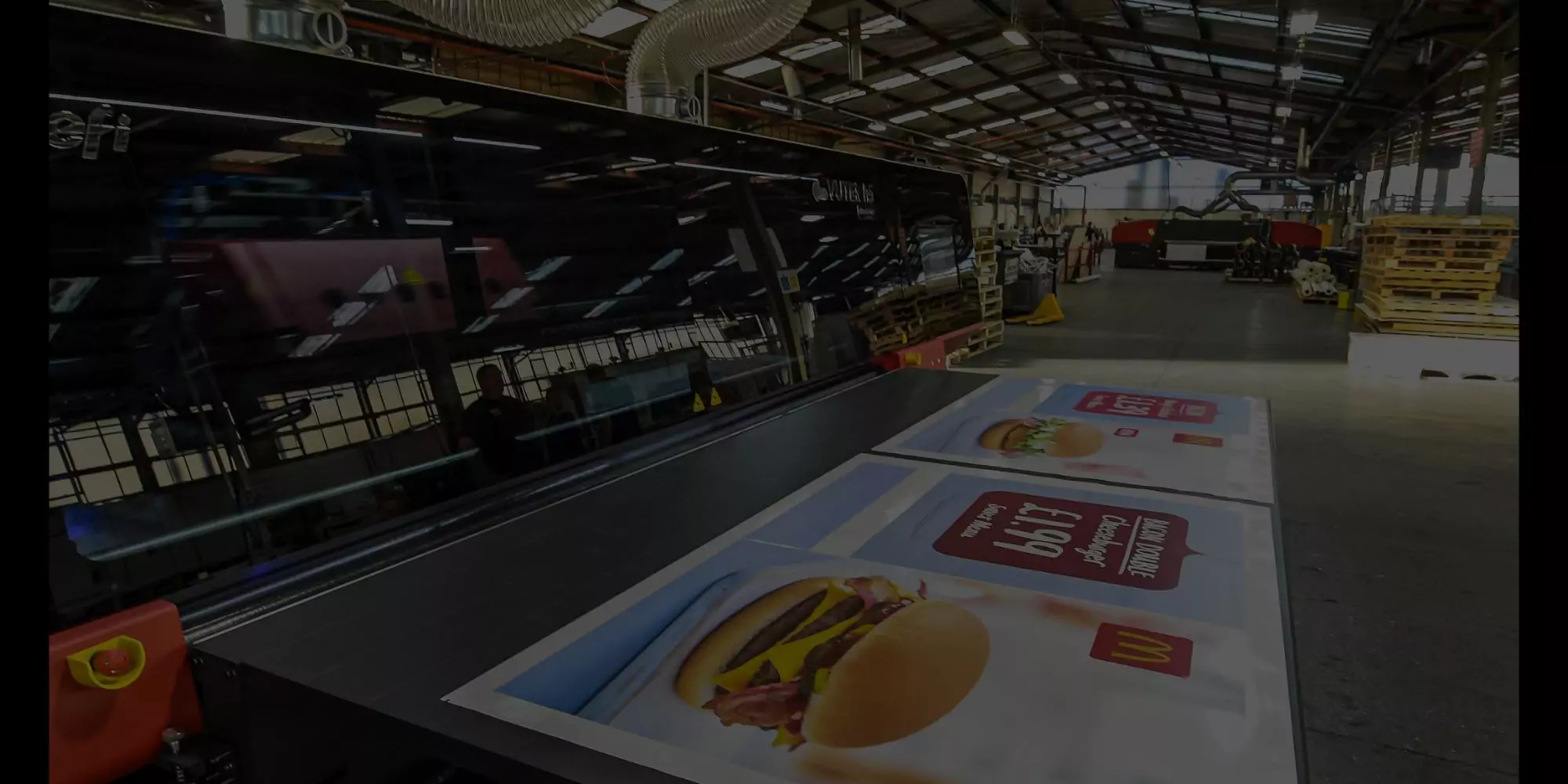
Are you planning a new trade show stand? Maybe you’re looking for some new shop branding or perhaps you need a poster for your new marketing campaign. A good large-scale design can reap fabulous dividends for your company and really get your brand noticed. So you want to design a large poster, banner, or sign to make your brand stand out from the crowd.
No doubt you’ll be keen to launch into designing your superb new product without delay. But before you take the plunge and dive into creating your design, it pays to understand a few basic design principles. Taking time to consider these carefully before you start could save you much time and heartache further down the road.
So what should you bear in mind when planning your large-scale printing project? Here are five top tips to help you.
1. Choose your image format carefully
Most graphic designers are used to working with bitmaps which are the commonest filetype for images. The commonest bitmap formats are: the standard format (BMP), Graphics Interchange Format (GIF), Joint Photographic Expert Group (JPEG), Portable Network Graphics (PNG), and Tag Image File Format (TIFF).
Each of these formats has its own qualities which make it better for certain uses e.g. JPEGs are commonly used for digital photos as it’s a compression scheme. However, there are some issues with the bitmap format when working at a larger scale.
Bitmaps are based around the use of pixels, which work using a fixed location and colour designation. We’ve all seen images become ‘pixelated’, or jagged and blocked, when they’re enlarged, and this is only made worse in very large formats. It’s difficult to find software that lets you work on a small enough scale to avoid pixelation when graphics are enlarged so greatly.
However, vector format uses mathematical equations instead, meaning that the relationship between your various elements always remains the same, however large your image. Your design always remains sharp. And as an added bonus, the file size for vectors is smaller than bitmaps, allowing faster spooling to your printer.
2. Handle your colour palette well
It goes without saying that you should choose colours which work well together in a complementary palette. Keep your theme simple – perhaps only two or three colours, which will make a better impact and enhance your brand identity well. The exception to this rule is for products where details are necessary, such as event posters, when you can broaden your range more successfully.
It may seem tempting to go for RGB colour mode when designing, as this has more colour choices available. But printers use CMYK mode, and will adjust the colours you choose accordingly, so it’s better to design using CMYK so you know exactly what colour you’ll be getting in your large format digital print.
3. Opt for a readable font
It’s generally best to stick to simple, readable fonts, so that your information can be read clearly, even from a distance. Script styles and serif fonts may look attractive from a design point-of-view, but are often difficult to read quickly. This will detract from your message when you only have moments to reach your customer.
Use a font that is well-spaced and has clear gaps between the words. Avoid bold type as it can look overloaded, and thin fonts as your text can get lost amongst your other elements. Make sure your font colour contrasts well with your background.
It’s also helpful to choose a cross-platform font that displays on Mac OS or Windows. If your print shop uses a different operating system, it may substitute your carefully chosen font for something totally different, ruining your overall effect. Arial, Times New Roman, Trebuchet and Verdana are all good options.
4. Ditch the clutter
Less is usually more when creating an effective design, so keep things simple and uncluttered. Go for striking logos and artwork, rather than over complicating the look, and keep text limited to the essentials. And don’t run your design right up to the edge – so-called ‘page bleed’ might cause you to lose the edge of your graphic during printing.
5. Check your design from a distance
This may seem very obvious, but your large format graphics are intended to be viewed from a distance. A design that looks great on your laptop screen may look completely different when viewed from a distance.
Try standing around 10 -20 feet away from your screen and check that the main aspects of your graphic still work well together. Does your design still have the intended impact? Is the overall look cohesive? Do the colours work well together? Can you read the information clearly? Asking someone else to take an impartial look at your design can often highlight any difficulties.
Designing a product for large scale digital printing may seem a bit daunting, as there’s plenty of aspects to consider in order to produce an effective result. However, reputable large format printing services, such as Cestrian, will always be willing to discuss your individual needs and offer helpful advice.


